BRAND DESIGN
NeoPETS
*
NeoPETS *
Neopets Logo Redesign
I had the privilege of updating the iconic Neopets logo, originally designed in 1999. Our goal was to refresh the brand image, giving it a more welcoming and modern look while preserving its recognizable silhouette and brand identity. The result, though simple, effectively accomplished our objective of modernizing the logo while maintaining its strong brand recognition.
Tales of Dacardia Logo: Project Background
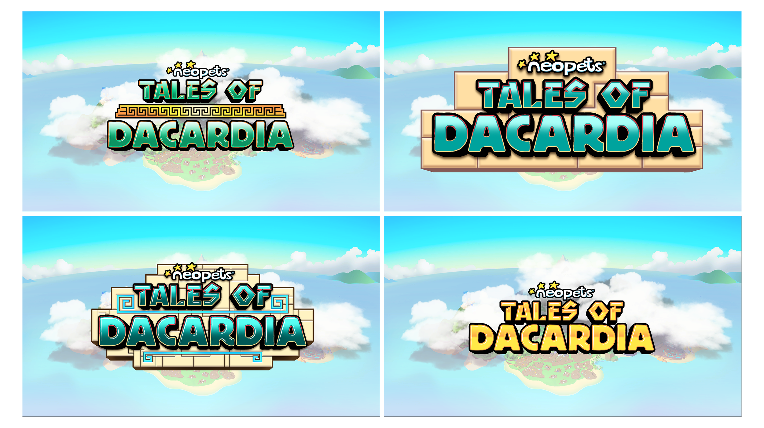
I led the branding and marketing efforts for the rebranded mobile game “Neopets: Tales of Dacardia," formerly known as “Neopets: Island Builders." This project included a comprehensive graphic and gameplay overhaul, immersing players in the enchanting world of Dacardia, where they build a small town and uncover the secrets of ancient ruins. Below, you'll find the final logo design that embodies the spirit of adventure and exploration in the game.
Tales of Dacardia Logo: Color Select Iterations
The logo design process for "Tales of Dacardia" involved exploring a variety of color iterations. These explorations aimed to capture the vibrant and whimsical nature of the game while ensuring the logo resonated with players. The selected color palette reflects the tropical and mysterious atmosphere of the lost island, inviting players to embark on their adventure.
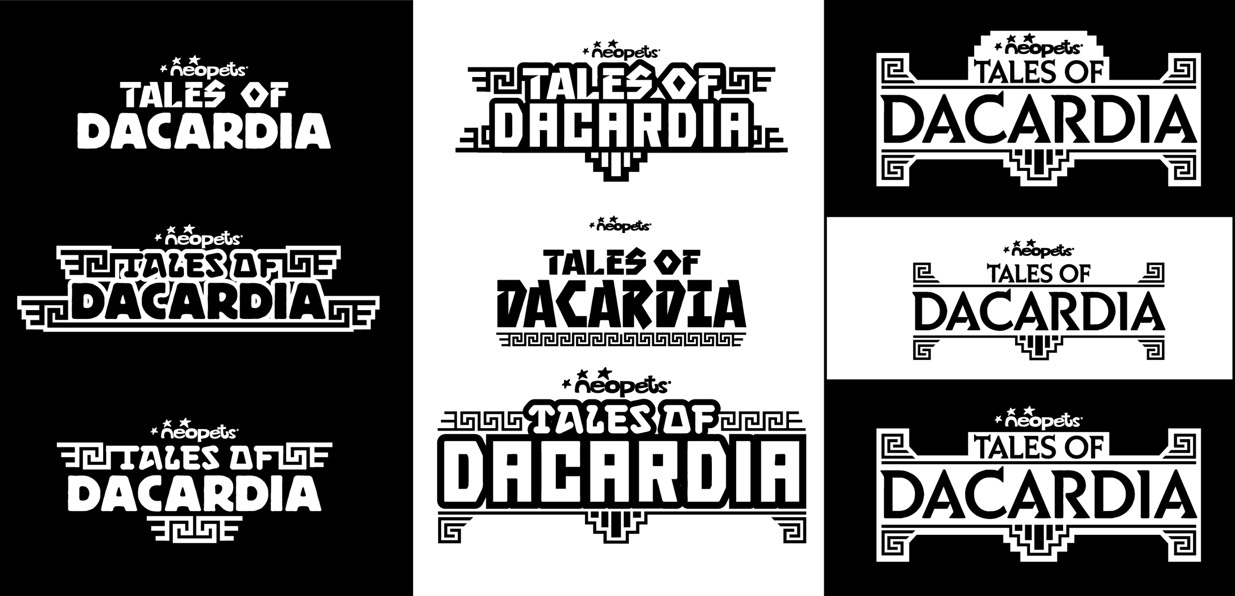
Tales of Dacardia Logo: B&W Typographic Studies
In the initial stages of the logo redesign for "Tales of Dacardia," I conducted extensive black and white typographic studies. These foundational explorations focused on developing the logo’s typography and silhouette, ensuring a strong and recognizable visual identity. This stage was crucial in defining the overall direction and character of the final logo.
FendeR
*
FendeR *
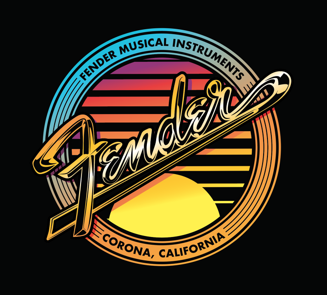
Fender E-commerce Merch: California Collection
I collaborated with Fender's e-commerce team to launch an updated line of merchandise inspired by California, the original home of Fender and the location of the Corona factory. Emphasizing a tactile aesthetic, we incorporated illustrated chrome elements from the classic Fender logo, complemented by the warm ombre of a California sunset. This graphic became the cornerstone of their merchandise direction for several seasons, celebrating Fender's heritage and connection to the vibrant culture of California.
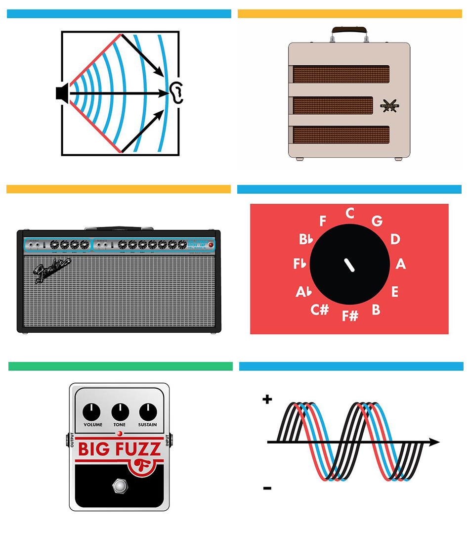
Fender Tone App: UI Element Illustration
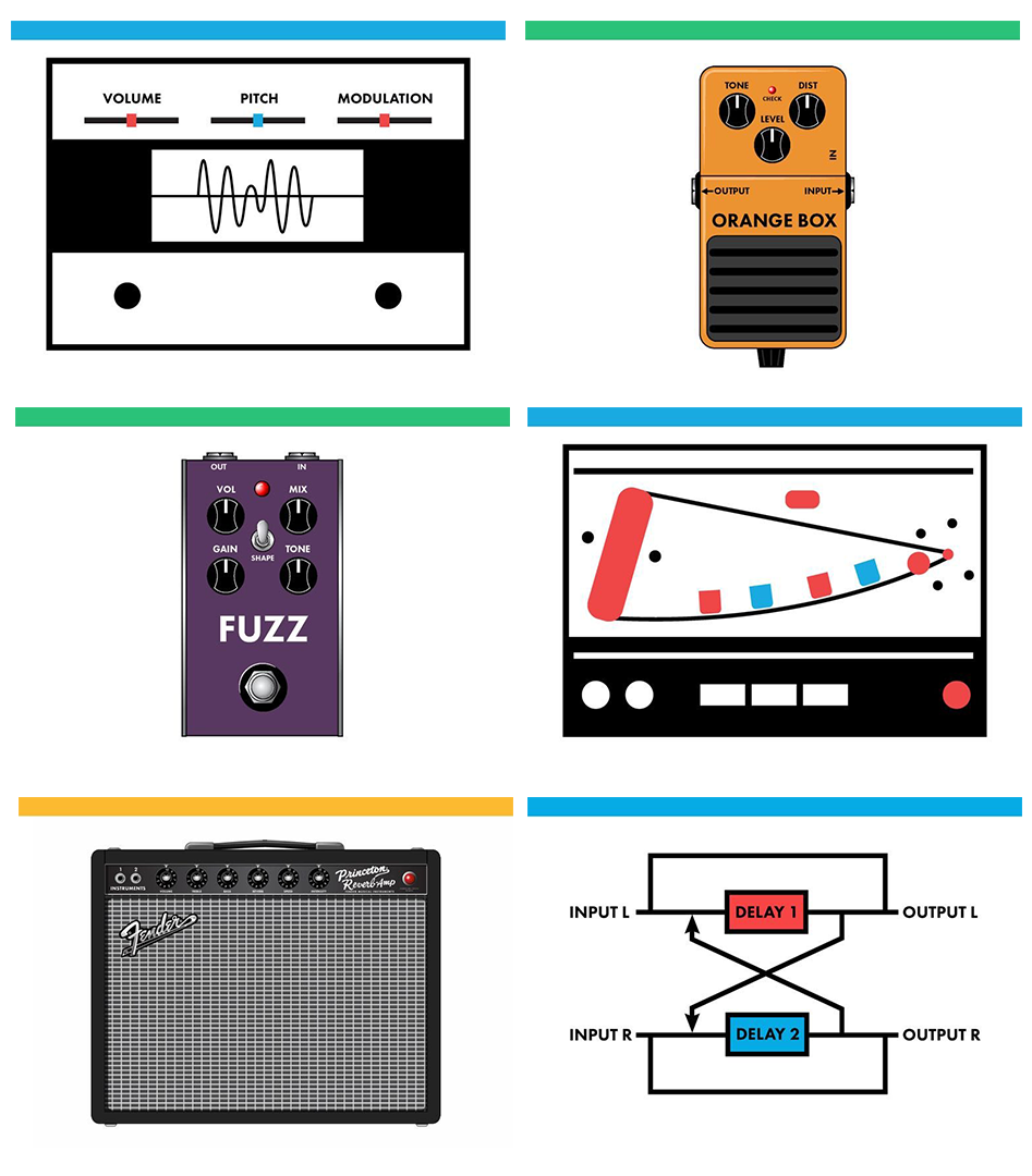
At Fender Digital, I was tasked with illustrating UI elements for the new "Tone" app, which connects to their innovative Bluetooth amplifiers capable of modeling a wide range of amps, pedals, and classic vintage analog effects. This project was incredibly rewarding and involved extensive research, particularly for accurately describing effects like delayed reverb.
I collaborated closely with the Fender R&D team to ensure that all my effect illustrations were scientifically precise. Additionally, I developed a cohesive illustration style for each category and created a simple color-coding system to aid in differentiation. This comprehensive design approach contributed to the Tone app, making it easier for our user base to learn and master the art of playing electric guitar.
Fender Tune App: UI Elements and Illustration
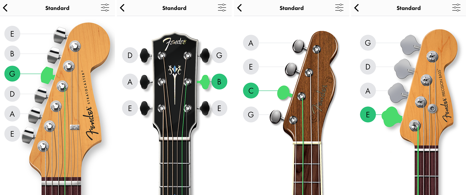
For the Fender Digital Tune app, I focused on creating UI elements and illustrations as part of Fender's initiative to enhance the digital experience for guitar players and guitar education. Initially, we experimented with simplified vector-style illustrations for the instrument heads, but they felt flat and unsatisfying within the UI.
Ultimately, we decided that hyper-realistic illustrations would better capture the app's essence, particularly since it is used in conjunction with actual guitars. This approach tied the entire app together, and the Digital Product team was very pleased with the final result, successfully elevating the user experience.
Danner
*
Danner *
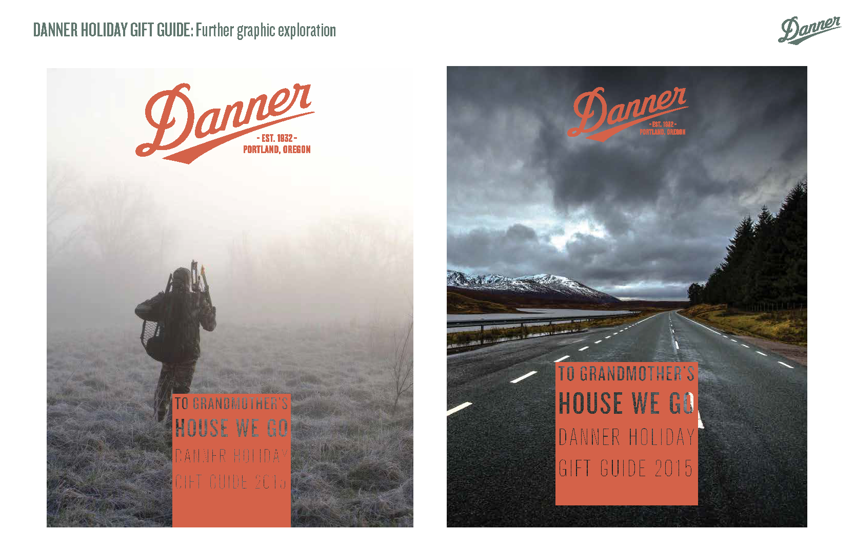
Danner Operation Manual: Brand Guidelines Style Guide
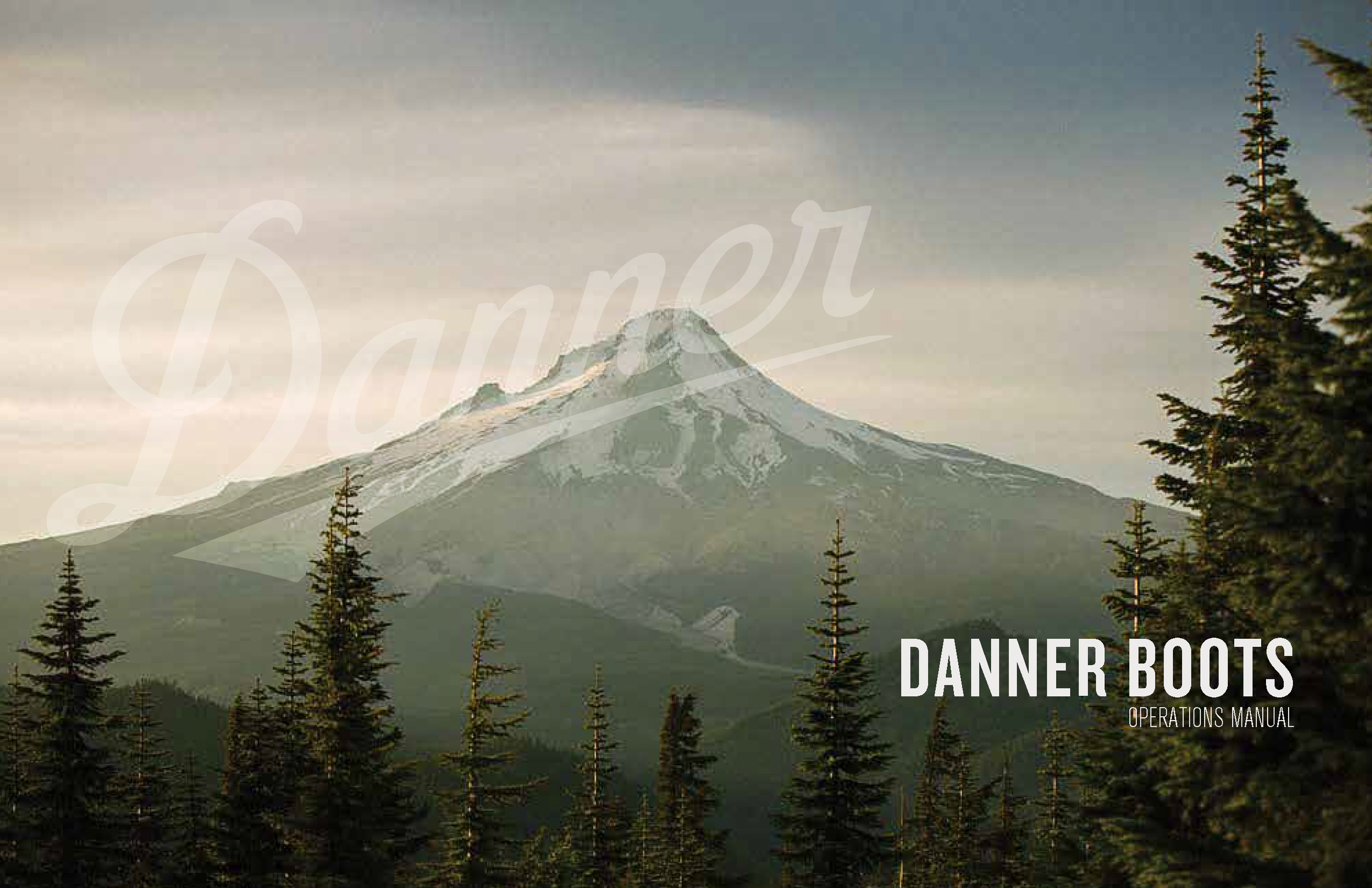
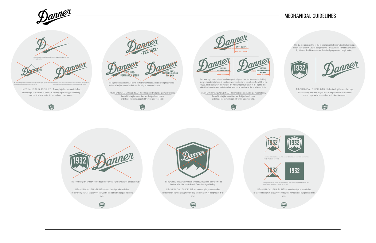
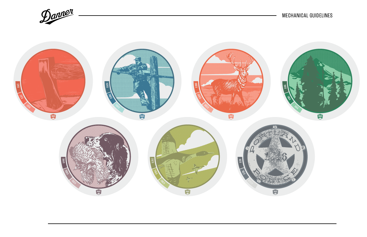
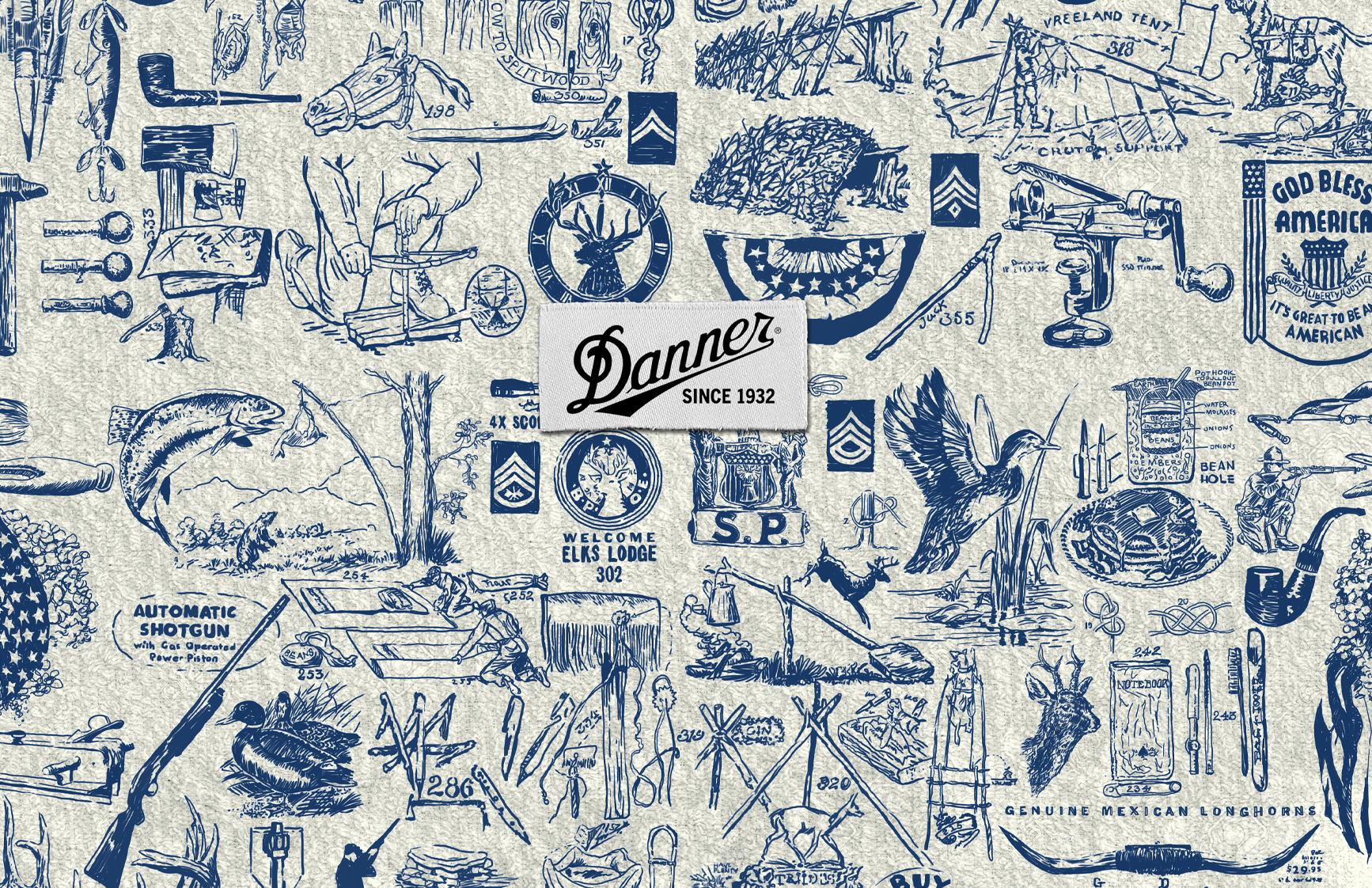
One of my favorite projects during my time at Kamp Grizzly was the design and art direction for the "Danner Operation Manual," a brand guidelines style guide for Danner Boots in Portland, Oregon. I was responsible for the illustrations and layout of the document, and while the overall direction was set by others, I was given creative control over the visual elements.
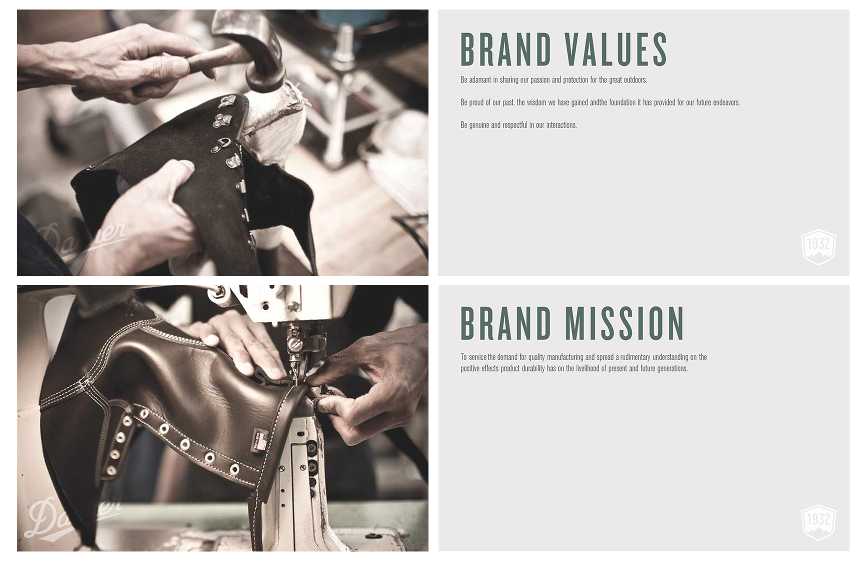
The purpose of the guide was to educate Danner employees and partners about the logo, typography, and color system, while also conveying the rich lineage and tradition of Danner Boots. Since 1932, these boots have served diverse communities, from loggers to military personnel and hunters in the Pacific Northwest. This project not only highlighted Danner's heritage but also reinforced the brand’s commitment to quality and craftsmanship.


